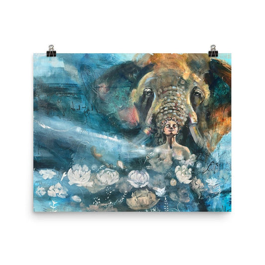
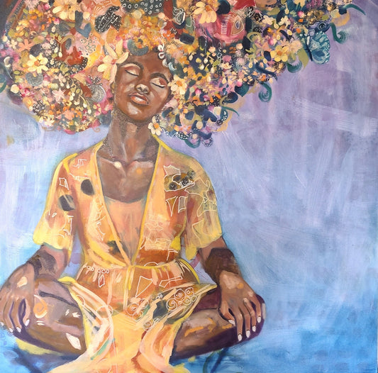
Colorful Animal Art for Neutral Living Rooms
Quick Summary
A colorful animal painting works well in a neutral living room because it becomes the focal point against calm walls and soft wood tones. Warm reds, soft blues, and mossy greens add warmth without overwhelming the space. Choose an animal and mood you keep returning to, since personal connection matters more than trends for animal art.
- One colorful painting on a plain wall can do more than several small accents.
- Warm reds, soft blues, and mossy greens hold their own beside beige and gray.
- Ask which animal you keep returning to when flipping through images.
- Abstract animal art suits neutral rooms because loose marks add motion without crowding walls.
- Pick one or two colors from the painting that already appear in your room.
Table of Contents
- Why Colorful Animal Art Works in a Neutral Room
- Animal Wall Art for Living Room Spaces That Feel Like Yours
- How Abstract Animal Art Brings Softness and Movement
- How to Coordinate Art With a Home Color Palette
- Choosing Your Next Piece From the Collection
- Frequently Asked Questions
Colorful Animal Art for Neutral Living Rooms
Last Updated: November 8, 2026
Why Colorful Animal Art Works in a Neutral Room
A neutral room can feel calm, but sometimes it feels a little quiet too. A single colorful animal painting can change that. One piece on a plain wall can often do more than a dozen small accents scattered around the room.
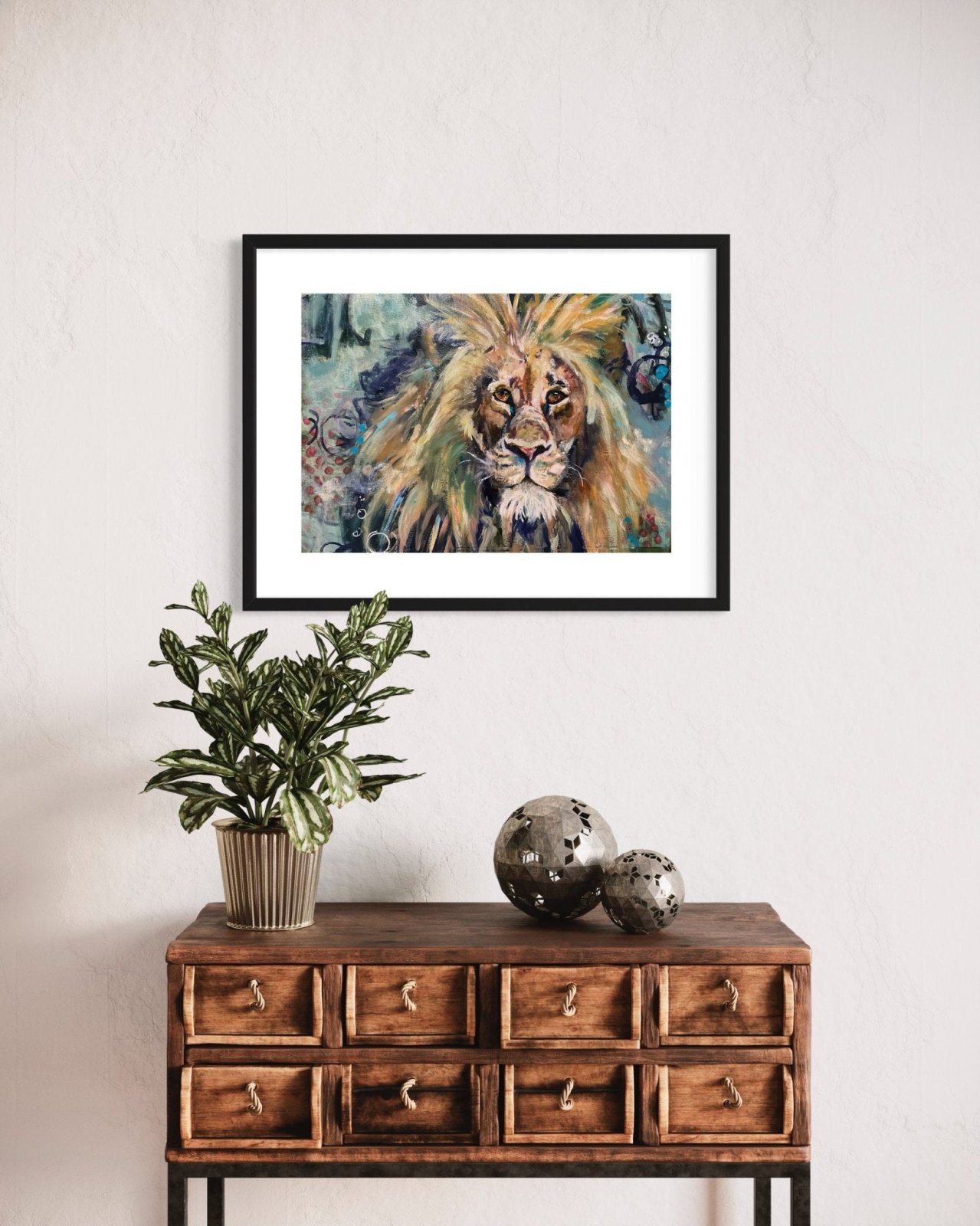
Neutral walls, linen sofas, and soft wood tones give your eye a place to rest. Against that backdrop, a painting with bold color pulls you in. The animal becomes the focal point, and the rest of the room settles around it.
Warm reds, soft blues, and mossy greens can hold their own beside beige and gray. They add warmth without shouting.
Animal Wall Art for Living Room Spaces That Feel Like Yours
Choosing an animal for your living room is a personal decision. Some people want a horse that suggests freedom. Others feel drawn to a bird, a dog, or a wild cat that reminds them of something they value.
Ask yourself a few simple questions:
- Which animal do I keep coming back to when I flip through images?
- Does the mood of the painting feel like the way I want to feel at home?
- Would I still enjoy looking at this piece on an ordinary Tuesday evening?
Your answers matter more than trends. A piece you feel connected to will keep its place on the wall long after a passing style has faded.
You can explore this idea through my original collection of animal paintings, where each piece invites a different kind of attention.
How Abstract Animal Art Brings Softness and Movement
Abstract animal art sits somewhere between the familiar and the unexpected. The animal may be recognizable, or it may appear only as a suggestion of shape, movement, and gesture. I find that this kind of work often feels softer than a literal portrait, and it leaves more room for your own interpretation.
Abstraction also suits neutral rooms well. The loose marks and open spaces add motion without crowding the walls. When the animal is suggested rather than fully described, your eye keeps returning to it, filling in what is not quite spelled out.
Layers and Texture in Mixed Media Pieces
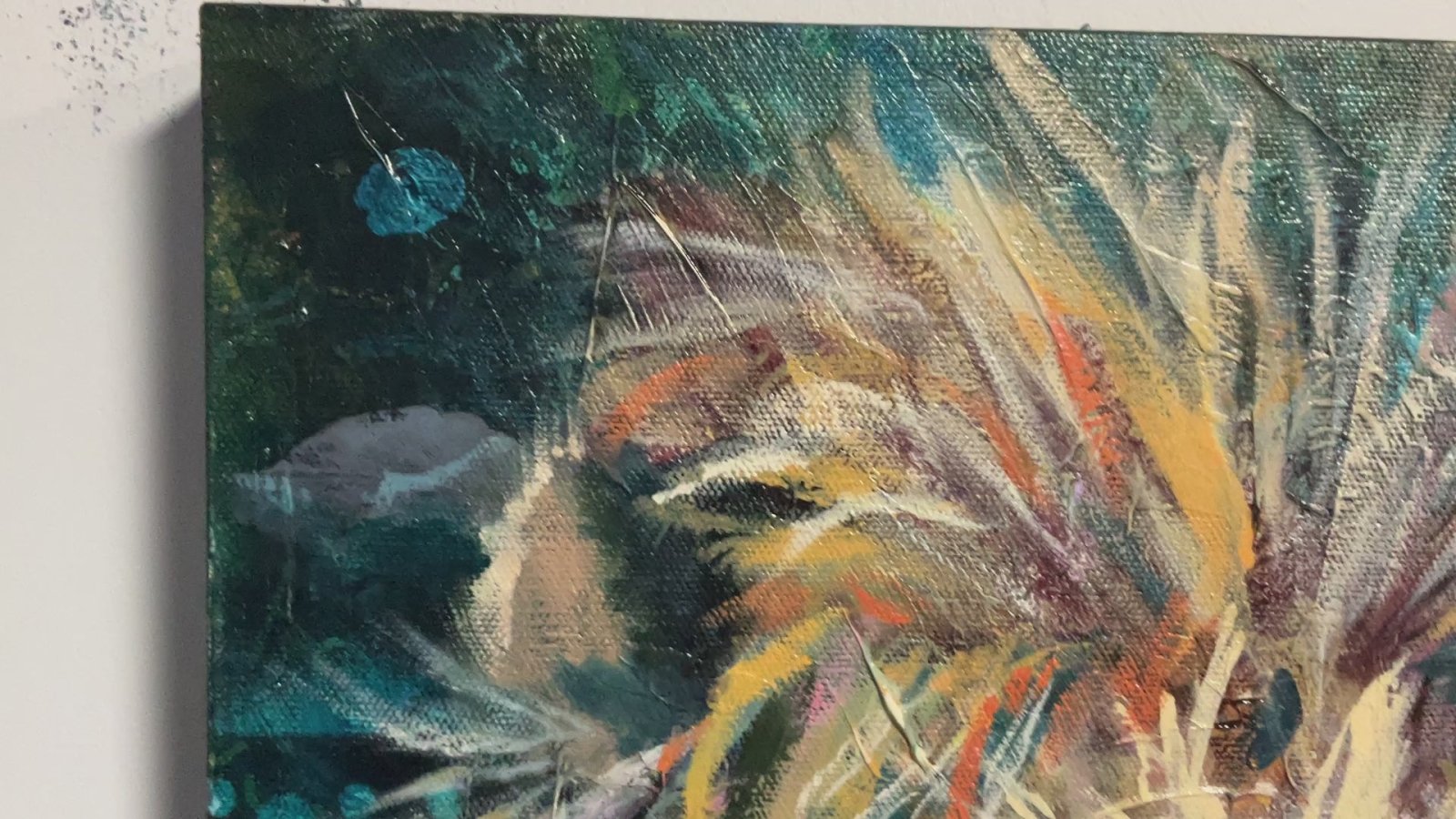
Much of my work is built in layers. I might start with collage, add expressive marks, then work over them with acrylic and oil. Each layer leaves a trace, so the surface holds a sense of history. That history is part of what you are looking at when you stand in front of the piece.
When you see a piece in person, look closely at the texture. You may notice paper edges, brushwork that catches the light, or areas where color peeks through from underneath. These details reward a second look and keep a painting interesting over time.
How to Coordinate Art With a Home Color Palette
You do not need to match your artwork exactly to your furniture. Instead, look for one or two colors in the painting that already appear in your room. A rust tone in a pillow, a blue in a rug, or a green in a plant can connect the piece to the space.
Start with what you already have. Notice the colors you reach for most often in your clothes and decor. Those choices often point toward artwork you will enjoy living with.
Reading Your Neutral Palette First
Before you shop, name the neutrals you are actually living with. Most neutral rooms lean one of three ways, and each one changes how a colorful animal painting reads.
- Warm neutrals. Cream, oatmeal, camel, and warm gray. A painting with reds, rusts, ochres, or mossy greens settles in easily here. Cool blues can pop sharply against warm walls, which is either the point or too much, depending on what you want.
- Cool neutrals. Soft white, dove gray, and charcoal. Blues, teals, and cool greens feel native here. Warm reds and oranges become the accent and draw the eye fast.
- True and high-contrast neutrals. Crisp white with black or dark wood. Almost any color holds here, but the painting's value matters more than its hue. A piece with strong lights and darks will feel at home. A piece that is all midtones can go quiet on a high-contrast wall.
A quick test: hold a paint chip or a fabric swatch from your room next to the painting, or next to a photo of it on your phone in daylight. For more on styling mixed media art within a room's palette, the guide walks through the details. You are not looking for a match. You are looking for whether the two agree.
Room by Room
Where the piece hangs changes what it needs to do.
In a living room, the painting is often the one saturated thing in a calm space. Give it a wall with some breathing room around it. If your sofa and rug are already busy, a single animal piece on a quieter wall does more than a gallery of small frames.
In a bedroom, you may want the color to feel softer. A painting with more open space and fewer hard edges tends to sit calmly above a bed. A bold, high-contrast piece can work, but it will keep the room feeling awake.
In an entryway, a colorful animal painting earns its place as the first thing you see. Entryways are usually small and pass-through, so a piece with a clear focal point reads faster than one that asks for a long look.
Style Cues That Help
If your room leans modern and minimal, let the painting carry the color and keep the frame simple. A thin float frame or a clean gallery wrap keeps attention on the work.
If your room leans traditional or collected, a warmer frame and a piece with visible texture bridge the old and the new. Mixed-media surfaces tend to sit well in rooms that already have wood, brass, and layered textiles.
If your room leans earthy and organic, look for paintings where the animal's colors echo stone, clay, or foliage. Those pieces feel like they grew out of the room rather than landing in it.
If you are unsure, bring a few colors from the painting into smaller objects over time. A vase, a throw, or a book spine can quietly tie everything together. You do not have to solve the whole room at once.
Here is a quick reference to the three neutral palettes the article describes and how each one changes the way a colorful animal painting reads.
| Neutral palette | Colors that settle in | What to watch for |
|---|---|---|
| Warm neutrals | Reds, rusts, ochres, mossy greens | Cool blues can pop sharply against warm walls |
| Cool neutrals | Blues, teals, cool greens | Warm reds and oranges become the accent and draw the eye fast |
| True and high-contrast neutrals | Almost any color, especially strong lights and darks | Midtone-only pieces can go quiet on a high-contrast wall |
Choosing Your Next Piece From the Collection
Choosing art is rarely a single decision. It often begins with a feeling, then turns into a series of small questions about color, subject, and how a piece will look in your home.
If you are ready to explore, take your time. Browse the animal paintings and prints, and notice which ones stop you mid-scroll. If you're looking for a thoughtful present, these animal art gift ideas for women who love to paint offer another angle on finding the right work. Those reactions are useful information. Once you have a favorite, you can see the Strawberry Spring IV oil painting with fox at https://sarahandreas.com/products/strawberry-spring-iv for $490.00, or look at Strawberry Spring II, the crow painting, at https://sarahandreas.com/products/strawberry-spring-ii for $300.00.


For a bold, expressive option, Regal Resolve is a mixed media lion piece at https://sarahandreas.com/products/regal-resolve for $200.00. Whichever you choose, I hope the piece feels like a part of your home.

Frequently Asked Questions
How do you add color to a neutral living room with art?
Start with one piece that carries the color you want to live with, rather than spreading small accents across the room. In a neutral space, a single colorful animal painting becomes a natural focal point. Look for the two or three strongest tones in the artwork and repeat one of them in a pillow, a throw, or a small object. This keeps the room calm while letting the color feel intentional. You do not need many colors to make a neutral room feel alive. One well-chosen painting often does the work.
What colors work well in a neutral living room?
Neutral rooms built on cream, greige, oatmeal, and soft white give colorful art room to stand out. Deep teal, warm red, ochre, and muted blue all sit comfortably against these base tones. Think about the undertones in your walls and furniture too. Warm neutrals pair well with warm artwork, while cooler grays often suit blues and greens. Testing a painting against your actual wall in daylight and lamplight will tell you more than any color chart.
How do you choose art that matches your living room color palette?
Begin by pulling two or three colors from your rug, sofa, or curtains and look for those same tones in the painting. You do not need an exact match. A piece that shares an undertone with your space usually feels more at home than one that matches perfectly. I also suggest noticing which colors in a painting you keep returning to. Those are often the ones that will carry the room.
Should wall art match the colors in a room?
Wall art does not need to match the room exactly. Many people find that a piece echoing one or two colors feels more personal than one that blends in completely. Matching too closely can flatten the space. Choosing a painting that complements your palette while adding its own voice tends to create a room that feels considered and lived in.