What Art Styles Suit a Calm Reading Nook Best?
Last Updated: October 29, 2026
Quick Summary
The best art styles for a calm reading nook are soft landscapes and seascapes, botanical and floral paintings, gentle abstracts, and quiet figurative work. Each one lowers visual noise instead of adding to it, so your eyes can rest when you look up from the page.
- Choose low contrast landscapes with muted earth tones or soft blues over dramatic sunsets with sharp edges.
- A single bloom on a quiet ground reads as calm, while a dense bouquet in saturated color reads as energy.
- For abstracts, look for soft edges, a limited palette, and open space to keep the piece calm.
- Hang the center of the art at eye level when seated, usually a few inches lower than gallery height.
- In a dim nook, choose a piece with lighter values so it does not disappear.
Table of Contents
- Why Art Sets the Tone in a Calm Reading Nook
- 1. Soft Landscape and Seascape Art
- 2. Botanical and Floral Paintings
- 3. Gentle Abstract Art
- 4. Minimalist and Quiet Figurative Work
- Choosing Calming Wall Art for Reading Nooks by Size and Light
- Meaningful Art for Home Reinvention
- Bringing a Piece Home to Your Reading Corner
- Frequently Asked Questions
Why Art Sets the Tone in a Calm Reading Nook
The best art styles for a calm reading nook are soft landscapes and seascapes, botanical and floral paintings, gentle abstracts, and quiet figurative work.
Here's what most nook guides get wrong: they treat art as the finishing touch. In a small space, art is often the loudest thing on the wall.
So before you shop, ask yourself one question. When you look up from your book, do you want your eyes to rest or to wander? That answer narrows the field fast.
1. Soft Landscape and Seascape Art
Landscapes and seascapes work because they give your eye somewhere gentle to go.
Look for low contrast and muted earth tones or soft blues.
Where this style falls short is scale. A wide landscape hung in a narrow corner can feel cramped.
Best for: readers who want a window-like feeling without an actual window. Skip if: your nook already has a strong view outside. Two competing horizons get busy fast.
2. Botanical and Floral Paintings
Floral work brings softness and a living quality to a reading corner. The trick is choosing the right kind.
I paint flowers often. My piece Whispering Flowers is a good example of the quieter approach: pale daisies emerging from deep blues and moody grays.
Pay attention to the background as much as the flowers. A soft, atmospheric background keeps the eye from working too hard.
Best for: readers who want warmth and a touch of nature indoors. Skip if: you prefer a strictly minimalist wall. Botanicals add detail by nature.
3. Gentle Abstract Art
Abstract art is the most misunderstood option for a calm reading nook. People assume abstract means busy. It doesn't.
The rule is simple. Look for soft edges, a limited palette, and open space.
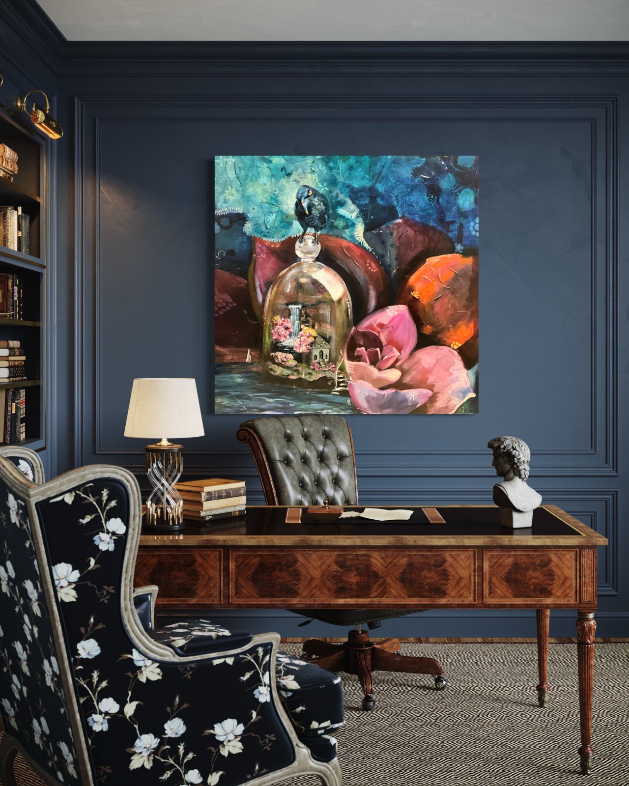
My painting Sonata in Blue leans on this idea. Soft blues, teals, and silvery grays build up in layers, with a single bird at rest.

One honest caveat: abstract work is personal. A piece that soothes me might leave you cold. Trust your first physical reaction.
4. Minimalist and Quiet Figurative Work
Figurative art can be calming when the figure is still. Think of a seated person, a bowed head, a hand at rest.
Minimalist style keeps the composition spare. One figure, one gesture, plenty of open space. That combination reads as contemplative rather than empty.
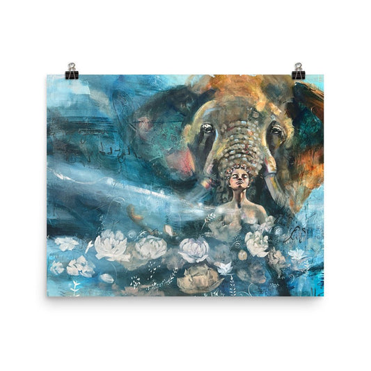
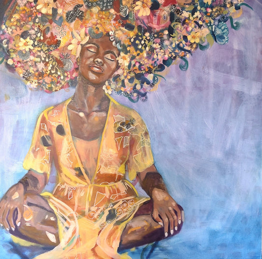
A framed print can be a smart way to try this style. My Daisies at Peace print shows a figure in a meditative pose surrounded by daisies, and it's the kind of image that doesn't ask for attention.

Best for: readers who want a focal point with human warmth. Skip if: you want the wall to stay purely about color and texture.
Choosing Calming Wall Art for Reading Nooks by Size and Light
Size and light decide more than style does. A piece that looks serene in a bright gallery can turn heavy in a dim corner, and the reverse is just as true. This is where most nook guides stay vague, so let's get specific.
Start with the wall, not the frame
A single small piece floating on a large empty wall feels lost. Either go bigger or group two or three smaller works together so the arrangement holds the space. Above a chair, the art should feel connected to the seat, not stranded near the ceiling.
A working rule many designers use: the art, or the group of art, should span roughly half to three quarters of the width of the furniture below it. Over a 30 inch armchair, that means a piece or grouping about 15 to 22 inches wide. Over a narrow bench, a single 12 by 12 inch canvas can be enough. The point isn't a formula.
Height matters too. Hang the center of the art at roughly eye level when you're seated, not standing. In a reading nook that's usually a few inches lower than the standard gallery height.
Daisies at Peace - Framed Fine Art Print | Meditation Art by Sarah Andreas →
Match the piece to your viewing distance
A reading nook is an intimate space. You're often two to four feet from the wall. At that distance, fine detail and subtle texture read clearly, and busy compositions can feel louder than they would across a room.
If you're choosing between two sizes, sit in the chair and hold up a piece of paper cut to each dimension. The one that feels settled at seated height is usually the right call. It's a low tech test that saves a lot of returns.
Read your light before you buy
Natural light from a window will warm up cool blues and greens through the day. A reading lamp throws warm light on one section of the wall. If your nook is dim, choose a piece with lighter values so it doesn't disappear.
Pay attention to direction, too. A window to the side of the art creates raking light that reveals texture and brushwork, which can be lovely for an oil painting.
A renter-friendly way to hang
You don't need to own the wall to hang art well. Lightweight frames and removable adhesive hooks work for prints and small canvases, and they come off cleanly when you move.
Here's a simple checklist to run before you buy:
- Measure the wall width above your chair or bench
- Measure the width of the furniture below and aim for art that spans about half to three quarters of it
- Note whether the light is warm lamp light, cool window light, or a mix
- Decide if you want the art to blend in or anchor the corner
- Check the piece from sitting height, not standing height
- Live with the image on screen for a few days before buying
That last step matters. Art you keep returning to is usually art you'll live with well.
Here are the size and light guidelines I use when placing art in a reading nook.
| Item | Value | Note |
|---|---|---|
| Art width vs. furniture below | Roughly half to three quarters of furniture width | A working rule many designers use |
| Over a 30 inch armchair | About 15 to 22 inches wide | For a piece or grouping |
| Over a narrow bench | A single 12 by 12 inch canvas | Can be enough |
| Hanging height | Center at eye level when seated | Usually a few inches lower than gallery height |
| Viewing distance in a nook | Two to four feet from the wall | Fine detail and texture read clearly |
| Dim nook | Choose lighter values | So the piece does not disappear |
| Bright nook | Deeper tones hold their own | Natural light warms cool blues and greens |
Meaningful Art for Home Reinvention
Meaningful art for home reinvention starts with one honest question: what do you want to be reminded of when you sit down?
Color is the fastest route into that answer. Soft neutrals and blue and white feel quiet and open.
Subject matters too. Mist, mountains, and seascapes suggest space and perspective. Botanical work suggests growth that happens slowly.
If you're rethinking a whole room rather than one corner, I wrote more about how a single piece can shift a space in 7 Ways Meaningful Art Transforms Your Home.
One thing I'd gently push back on: don't wait until your life feels settled to choose art. Choosing it is part of settling.
Bringing a Piece Home to Your Reading Corner
Once you've narrowed the style, the last step is the piece itself. This is where a lot of people freeze, because there are always more options than answers. A short decision framework helps more than another gallery of inspiration.
A simple way to choose
Ask yourself these questions in order. The first one you can't answer is the one to work on.
- What do I want to feel when I look up from the page? Rest, warmth, space, or quiet company. Your answer points to a style family more reliably than any trend list.
- What does the corner already have? A strong view, a bold wall color, or a busy textile changes what the art needs to do. Sometimes the calmest choice is the piece that doesn't compete.
- What scale fits the wall and the seat? Use the proportion and seated-height guidance above. A beautiful piece in the wrong size will never feel settled.
- How does it look in my light? Check the image on screen in the room where it will hang, at the time of day you actually read.
- Would I still want to look at this in a year? If you keep returning to the image over a few days, that's a good sign. If you're drawn to it once and then forget it, let it go.
Try before you commit
If you're torn between an original and a print, a framed print is one way to live with a style before choosing a larger piece.
For a reading corner, I'd start with something that rewards quiet looking. Daisies at Peace brings a meditative figure and a soft palette. Presence at Peace adds a halo of flowers and butterflies around a seated figure, a little more color while staying calm.

If you'd rather have an original, a small canvas can anchor a corner beautifully. I'm glad to look at a photo of your wall and talk through scale and placement before you decide. No pressure either way.
When you're ready, you can explore my available paintings and prints and see which one feels like it belongs in your corner.
Frequently Asked Questions
What kind of art makes a room feel more relaxing?
Art with a limited, soft palette tends to settle a room. Think muted blues, greens, warm neutrals, and gentle contrasts rather than high-saturation blocks of color. Subject matter matters too: landscapes, seascapes, botanicals, and quiet figurative work give the eye somewhere calm to rest. In a reading nook, the goal is presence without distraction, so a piece that reveals more the longer you look usually works better than one that grabs attention the moment you walk in.
Should I choose abstract or representational art for a reading nook?
Both can work, and the choice comes down to what you want to look at while you settle in. Representational pieces, like a botanical painting or a landscape, give you something recognizable to return to. Abstract work leaves more room for your own interpretation. If you read for long stretches, a softer abstract with layered texture can be easier on the eye because there are no sharp details demanding to be named. Try living with an image for a few days before deciding.
How does color palette affect the mood of a reading corner?
Color does a lot of quiet work. Cool blues and greens tend to slow the eye and create a sense of space, while warm earth tones and soft pinks bring warmth and intimacy. A piece that echoes colors already in the room, like a chair fabric or a rug, will feel settled rather than separate. If your nook gets strong afternoon light, cooler tones can balance the warmth; in a dim corner, a painting with lighter values helps the space feel less closed in.
How do I choose calming wall art for reading nooks that are small?
Small spaces call for pieces that don't compete with the room. A single square canvas or framed print sized to the wall above your chair often works better than a cluster that crowds the corner. Pay attention to viewing distance: in a tight nook you'll be close to the art, so texture and brushwork become part of the experience. A 10 by 10 inch original or a framed print at a similar scale can hold a small wall without overwhelming it.
What role does texture play in creating a grounded home environment?
Texture is what makes a room feel lived in rather than staged. In a painting, visible layers, brushwork, and collage give the surface depth that photographs rarely capture, and that depth can make a piece feel more personal over time. Pair it with soft textiles nearby, like a wool throw or a linen cushion, and the corner starts to feel grounded. When you buy online, ask about the surface and finish so you know what to expect in person.
If your reading corner still feels unfinished, the real question may not be which style to buy. It may be whether you've given yourself permission to claim that corner at all. When you're ready, browse the available paintings and prints, and choose the one you'd want to look up at after a long day.